Time Left - 08:00 mins
Quant Quiz on Line Graph
Attempt now to get your rank among 2220 students!
Question 1
Direction: Study the following line graphs carefully and answer the questions given below.
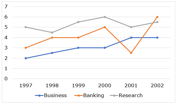
The given below line graph shows the percentage expenditure (of GDP) on Business, Banking & Research.
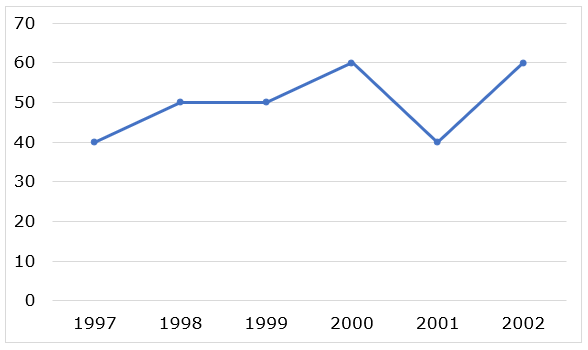
The given below line graph shows the GDP from 1997-2002 (in crores rupees).
The given below line graph shows the percentage expenditure (of GDP) on Business, Banking & Research.
In 2000, what is the ratio of amount spent on Business to Banking to Research?
Question 2
Direction: Study the following line graphs carefully and answer the questions given below.
The given below line graph shows the percentage expenditure (of GDP) on Business, Banking & Research.
The given below line graph shows the GDP from 1997-2002 (in crores rupees).
The given below line graph shows the percentage expenditure (of GDP) on Business, Banking & Research.
The GDP growth from 1997 to 1998 is what per cent of the GDP growth from 2001 to 2002?
Question 3
Direction: Study the following line graphs carefully and answer the questions given below.
The given below line graph shows the percentage expenditure (of GDP) on Business, Banking & Research.
The given below line graph shows the GDP from 1997-2002 (in crores rupees).
The given below line graph shows the percentage expenditure (of GDP) on Business, Banking & Research.
What is the total amount (in crore) allotted to Research during 1997-2002?
Question 4
Direction: Study the following line graphs carefully and answer the questions given below.
The given below line graph shows the percentage expenditure (of GDP) on Business, Banking & Research.
The given below line graph shows the GDP from 1997-2002 (in crores rupees).
The given below line graph shows the percentage expenditure (of GDP) on Business, Banking & Research.
In which of the following years is the total amount allotted to Business, Banking and Research the maximum?
Question 5
Direction: Study the following line graphs carefully and answer the questions given below.
The given below line graph shows the percentage expenditure (of GDP) on Business, Banking & Research.
The given below line graph shows the GDP from 1997-2002 (in crores rupees).
The given below line graph shows the percentage expenditure (of GDP) on Business, Banking & Research.
What is the difference between the amount allotted to Business in 1999 and that in 2000?
Question 6
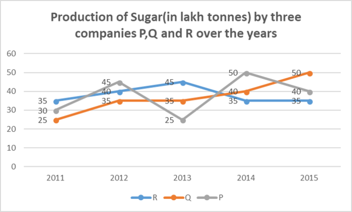
Direction: The line graph provided below gives the data of the production of sugar (in lakh tonnes) by three different companies P, Q and R over the years. Study the graph and answer the questions that follow:
What is the ratio of the average production of company P in the period 2013 to 2015 to the average production of company Q in the same period?
Question 7
Direction: The line graph provided below gives the data of the production of sugar (in lakh tonnes) by three different companies P, Q and R over the years. Study the graph and answer the questions that follow:
What is the percentage increase in the production of the company Q from 2011 – 2014?
Question 8
Direction: The line graph provided below gives the data of the production of sugar (in lakh tonnes) by three different companies P, Q and R over the years. Study the graph and answer the questions that follow:
The average production for five years was maximum for which company?
Question 9
Direction: The line graph provided below gives the data of the production of sugar (in lakh tonnes) by three different companies P, Q and R over the years. Study the graph and answer the questions that follow:
For which of the following years, the percentage rise/fall in production from the previous year is the maximum for company Q?
Question 10
Direction: The line graph provided below gives the data of the production of sugar (in lakh tonnes) by three different companies P, Q and R over the years. Study the graph and answer the questions that follow:
In which year, the production of Company R as a percentage of the production of company Q was maximum?
- 2220 attempts
- 20 upvotes
- 76 comments
Nov 2PO, Clerk, SO, Insurance